Good design is good business.
I spend pretty much all day obsessing about how to improve user experiences. I’ve observed a number of recurring software design problems over the years, and I thought I’d share a handful of them here for your consideration.
Problem #1: User design to decorate instead of solve problems
A client recently came to us and explained that the web-based software product they built years ago is suffering in the market. They were losing their existing customers and failing to convert new customers, mostly due to upstart competitors that are providing really great user experiences.
So we dug in and started investigating their software, and we quickly realized that the whole user experience is—to be franks—a hot mess. The navigation is elaborately confusing, the input methods are inconsistent, there’s no visual hierarchy to the data, etc. It’s no wonder customers were jumping ship for their competitors.
So we laid out a plan, and explained that we’ll need to do some user research, develop a coherent content strategy, begin working out a new information architecture, establish some interface design patterns, etc.
But they stopped us mid-sentence and said “Whoa, stop, you’re misunderstanding. That’s not what we want at all.”
I was confused. “But I thought….”
“We just want you to give the application a fresh coat of paint!” they said.
Human beings are visual creatures, so it’s understandable how they could come to the conclusion that a superficial re-skinning of the application would solve their problem. They noticed that their competitors were hip and trendy, so they figured if we could changes some fonts and colors in their application so it also looked hip and trendy, all their customers would come rushing back.
Unfortunately, that’s not how design works.
Design isn’t decoration; it’s problem solving. And companies can’t make real progress when they confuse “UI” (user interface) design with the broader “UX” (user experience) design. UI can make things look good, but it seldom solves the issues hiding beneath the surface.
Problem #2: Building software without doing proper user research
In aviation, there’s something called the “1-in-60 rule,” a rule of thumb that a heading error of one degree will result in being about about a mile off track after traveling 60 miles. If your heading is off by 15 degrees, for example you’ll be about 15 miles off track.
Well, the same principle applies to software projects. If your strategy is just off by 15 degrees (which isn’t much) on a $600k project, you’ll need about $150k worth of additional work to get it back where it should have been.
Software companies are hesitant to invest in user research early on, reasoning that they “already know what customers want” and that they can save and time and money by skipping it.
This is consistently frustrating to users, who then have to deal with software with flaws that seem obvious to them. I wish they’d just asked me, they think. I could have warned them not to design it this way.
Software companies often follow a process that completely shields them from real customer feedback until the product has been completed and launched to the market. That’s when the users give them the bad news, far too late for them to do anything about it.
I’ve talked to a lot of startups that are like the stereotypical dad on a road trip, refusing to ask for directions because they swear they know where they’re going. Perhaps that’s one of the reasons that the startup failure rate is so spectacularly high.
Ralph Waldo Emerson famously wrote that “[t]he voyage of the best ship is a zigzag line of a hundred tacks.” User research gives companies the opportunity to refine their course early and often, and to prevent the expensive mistakes that are otherwise almost inevitable.
Problem #3: Treating users like they did something wrong
Some years back we were hired to redesign these key duplication kiosks found inside Walmart, Home Depot, etc., because they were experiencing unusually high abandonment rates.
People would actually walk away in the middle of the process because they were getting so frustrated. This is understandable if you think of the added stresses these users are typically dealing with. People really only get keys copied when they’re going through some kind of stressful experience, whether it’s buying a new house, replacing the locks after a break-in, moving in with a new roommate, etc.
On top of that, they’re probably standing in the middle of a busy area of a store, full of lights, colors, sounds, and people walking by. These users are typically operating in a state of heightened anxiety before they even get started.)
One of the major user experience problems we observed was that the interface was presenting a variety of messages to the user as full-screen, red error messages. The system was trying to explain that it couldn’t do something the user wanted, but the way it was presented made the user feel like they were being accused of something they couldn’t control or fix. It was making them feel stupid and stressed out, and we couldn’t blame them for walking away.
When we redesigned the interface, one of the key principles we followed was “It’s not the user’s fault.” We’d gently coach the user along, nudge them in the right direction when needed, offer reminders, etc., but we avoided any negative-sounding messages, and basically removed all error states from the application because they just weren’t needed. We refactored all of them into some other kind of user-friendly communication.
I still watch people using these kiosks whenever I happen to be a store that has one, and after this redesign I’ve never seen anyone abandon it in the middle of the process. In fact, they often have a smile on their face, probably relieved that something is working out well for them.
Problem #4: Designing around technology instead of around the user
Anyone who’s ever been in sales knows that most sales tracking software is annoying and painful. To give an idea of how overly complicated it can get, here’s a diagram of the core functionality of one of the more popular tools:
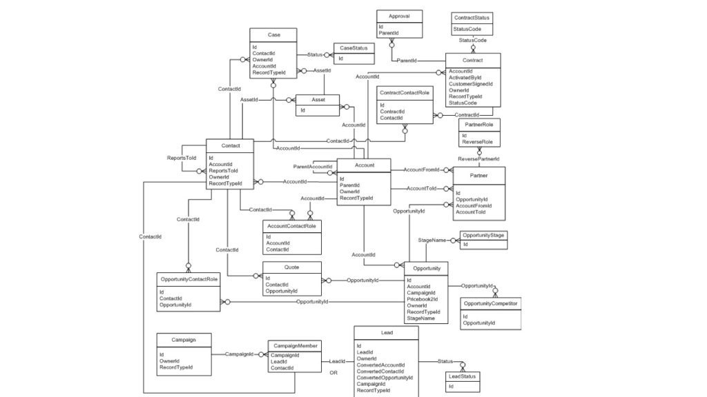
Let’s say a potential client calls, and you want to quickly jot down their information. On a typical system, you’d have to create a company record, then a contact record associated with that company, then an opportunity associated with that contact, then a follow-up task associated with that opportunity, and so on. It’s a time-consuming pain in the neck when you’re trying to quickly move on with your day, and many sales professionals eventually their tracking software and keep track of their notes some other way.
The main problem here is that software is often designed around database tables. The default assumption is that there should be a screen for every table, so a relatively complex set of relationships like the one described above, the knee-jerk reaction is to build them as multiple screens.
When I was responsible for business development for our company, I got so frustrated with the existing systems available that I eventually snapped, and spent a weekend doing something nobody should ever do: building your own software solution instead of using an existing one.
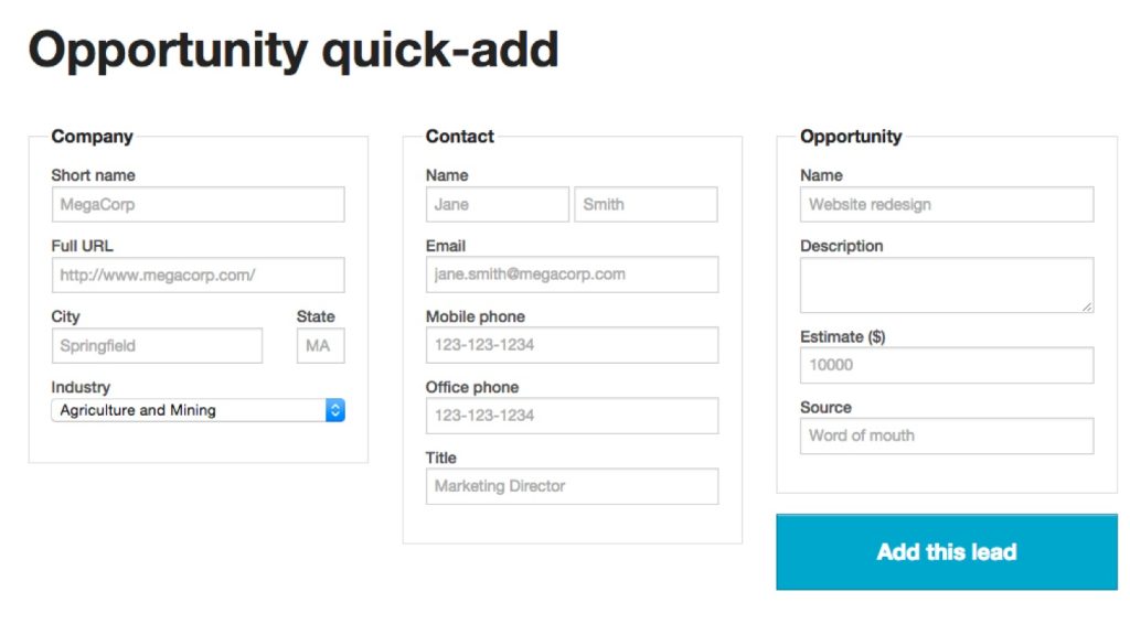
I built it for speed. Not processing speed or loading speed, but human speed. I wanted to quickly take notes while I was on the call, and then just hit the button once and have all the associated records (company, contact, opportunity, follow-up reminder, etc.) all be created in the background and magically tied together.
From a technical perspective, it wasn’t hard to pull this off. The part most software solutions had missed was actually designing it around the needs and wants of the user instead of around the database.
It’s only “user experience design” if you actually prioritize the user over the technology platform.
Problem #5: Hurting frequent users by optimizing only for new users
This is Apple’s iMovie software:
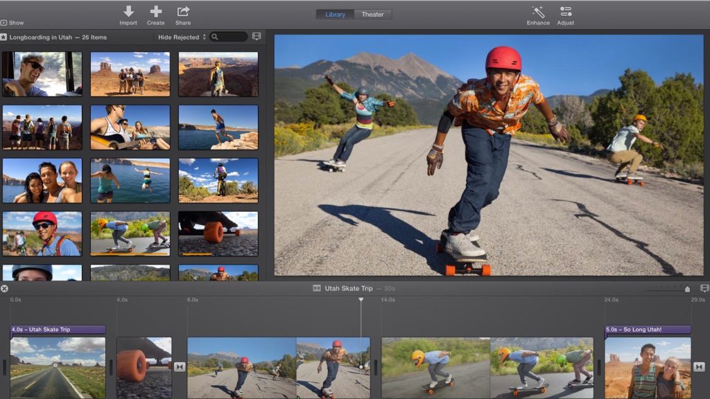
It’s a brilliantly-designed piece of software, and a role model for taking a relatively complicated task—video editing—and making it remarkably easy to use. It’s the perfect solution for the one time a year you need to put together a vacation video to show grandma what the kids have been up to.
However, if you’re editing high-end video on a daily basis, iMovie would eventually drive you crazy. For that, you need a more robust piece of software.

This is Avid, a professional-grade video editing tool. It’s a heck of a lot more complicated than iMovie, but that’s not because it’s designed poorly. It’s just designed for different needs.
It’s important to remember that what’s helpful for novice users may frustrate regular users. Slow animations, hidden functionality, simplified data presentation, etc., can all get in the way of an efficient workflow.
Problem #6: Leaving design to designers alone
Designers love to think they’re the answer to all these problems. (I know this because I’m a designer myself.)
Software companies sometimes think they can simply hire a rockstar designer, and all their user experience issues will magically go away. That’s not really how it works out, though.
Design is a process, not a talent. When you’re looking for designers (or a design team), you should be searching for those who really understand and respect the larger design process, not just a rockstar with a hot-looking portfolio. It’s about much more than individual genius and talent.
Design is fundamentally a team sport, involving a wide variety of disciplines, perspectives, and insights. There’s no room for ego in the design process.
It has to be a collaborative discipline, or it simply won’t work out. Design is too important to be left to designers alone.
Solving these problems will make a bottom-line difference
Former IBM CEO Thomas Watson, Jr., famously stated that “Good design is good business.”
More recently, IBM shared their internal rule of thumb that every $1 invested in ease of use could be expected to return between $10 and $100 in revenue. That’s not a bad investment.
Fixing these kinds of design-related issues within your company can take a little adjustment, and sometimes an up-front investment, but it’ll ultimately pay off in the form of increased customer acquisition, increased customer retention, increased efficiency, reduced rework, and lower costs overall.