· by James Archer · 9 min read
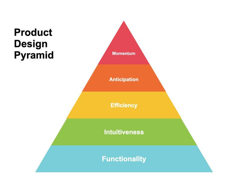
The Product Design Pyramid
If you make it to the top, you'll have one of the best and most delightful products in your market. The product design and user experience design industries are full of vague phrases like "delightful experiences" without a lot of specifics about how to get there. Many designers find themselves fl…
If you make it to the top, you’ll have one of the best and most delightful products in your market
The product design and user experience design industries are full of vague phrases like “delightful experiences” without a lot of specifics about how to get there. Many designers find themselves flailing around going after those ideals without really understanding how to navigate toward them. I first developed the Product Design Pyramid in some years back while serving as the head of product design for a large software company in order to train designers on exactly how to achieve those delightful experiences in a methodical, scalable, and repeatable way. Since then, I’ve referred back to it many times as a training device for user experience designers, and have found that it holds up pretty well over time and across different products, companies, and situations. So, I figured I’d finally share it.
The purpose of the Product Design Pyramid is to understand the relative priority of the key aspects of product and user experience design that ultimately lead up to great experiences. Ultimately, you’re aiming for the top of the pyramid, but you can only get there by accomplishing the lower levels first.
Functionality
Does it do everything it needs to do?
- Make sure the basics are covered. When designing an interface, make sure you think through associated features or functionality that may be required. For example, if a product has a login form, make sure it also has a password reset option, a logout option, etc. (There are few things more embarrassing than forgetting something obvious.)
- Optimize for the majority. Focus more on what most users will do rather than what a few users might want to do. It’s tempting to get caught up in fringe use cases, but we should always put the bulk of our attention on the most common needs and user goals.
- Provide a complete experience across major devices and platforms. Design with the assumption that the user should, in most cases, have full use of all features across desktop, tablet, and mobile devices. No common device should provide an experience that is (or feels) particularly limited. Users should be able to effectively use all features and functionality across any device.
- Build from user insight. Specific, validated insights about users (or hypotheses that enable us to get those insights) are the foundation of high-quality, effective design work.
- Provide meaningful options. Remember that users value their freedom and don’t assume they’ll want to follow a single path to a feature or do things in a specific order. Provide multiple ways to do the same thing or get to the same place. Also, because users will frequently change their mind, we should provide an obvious and reassuring way for them to cancel, back out, or try again later.
- Think outside the screen. Don’t assume all interactions need to take place in a traditional desktop or mobile screen. Consider ways to integrate SMS, chat, email, and other communication platforms as extensions of the product.
- Design for varying levels of interest. Some users will just want a high-level overview, while others will want to drill into the details. Design in a way that accommodates both modes effectively.
Intuitiveness
Can it be used without training or documentation?
- Assume zero pre-training. Customers should be able to register, onboard, use, and see clear business value and results without ever talking to a salesperson, trainer, or coach. Let the user learn in context. Teach them about the product within the interface itself as they explore it, rather than asking them to stop and learn beforehand.
- Speak the user’s language. Adopt terminology and mental models directly from user research. Listen to how they talk and understand how they think. Use those insights to determine how elements are named, organized, and used.
- Progressively reveal complexity. Instead of overwhelming the user with everything they can do up front, start simple and make sure they understand the basics. Additional features and content can be revealed over time as they explore and drill down into the product.
- Reuse established design patterns. Where reasonably possible and appropriate, stick to existing design patterns instead of creating new ones. This helps users feel comfortable even when performing new tasks or using new features. Avoid adding cognitive load to the user by designing a new way to interact unless there’s a compelling, user-centered reason to do so.
- Don’t assume the user will learn over time. The interface should be clearly understandable and intuitive on first time use. Your product is just one of hundreds of digital interactions the user is dealing with, and they might go for extended periods of time between use. Allow them to effectively use the product even if they’ve forgotten everything they’d learned about it.
- Include labels and explanatory text. Each screen and piece of functionality, as well as most interface items, should include a label/title and (where appropriate) additional explanatory text to help the user understand. Verbal recognition is actually faster and more reliable than visual recognition for all but the very simplest concepts.
- Design for people, not technology. It’s tempting to add a screen for every feature, a form field for every database column, and so on. Instead, we should design for the actual needs and goals of our users and modify our technology (or make it work harder) as needed.
Efficiency
Do we get the user to value as quickly as possible?
- Continually reduce “time to value.” Get the user into the system, performing tasks, and seeing value as quickly as possible, not just during their first time use but throughout their everyday use of the product.
- Adopt a just-in-time mindset. Push configuration, instructions, and questions as far into the process as possible. Don’t distract the user with things that aren’t needed yet.
- Optimize for the most important/common tasks: Surprise the user by how quickly and easily they can find perform tasks. Provide shortcuts to frequently-used elements. Prioritize the most important elements.
- Avoid interrupting the user’s flow. Help the user stay focused on the task at hand by providing guidance and flows that keep them on task (while still giving them the opportunity to change their minds if needed).
- Allow users to move quickly. Milliseconds add up quickly for users engaging with the product on a daily basis, so unnecessary animations, extra clicks, long load times, or anything else that creates a perception of friction will annoy and discourage them.
- Automate whenever possible. Avoid asking the user for something we should be able to find or figure out on our own.
- Provide in-context navigation. Link to related data whenever possible. A user should be able to click on almost anything anywhere to see the details behind it.
- Put things where people will most likely see them. Don’t make the user hunt around for things. Status messages should appear near the information they pertain to, forms should come up near the center of the screen, and so on.
- Don’t make everything efficient. Some features, especially those with significant effects, should require additional thought from the user. It’s okay to include confirmation steps or require an additional click or two to avoid big things happening too easily.
Anticipation
Do we predict and address the user’s next thoughts?
- Manage expectations (and avoid surprises). Make sure the user understands what’s coming, so they never feel surprised or have to wonder when or how it’s going to happen. Everything should feel inevitable and obvious.
- Answer questions before the user asks. Provide constant feedback, in-context progress updates, status notifications, and reassurance. Don’t force the user to ask questions like “Did it work?” “Where are we in the process?” “Is it done?” “What happens next?”
- Provide shortcuts to logical next steps. Anticipate what a user is going to want them to do next and provide them a quick and obvious way to get started.
- Be interested, and remember. The product should pay attention to the user’s behavior, learn from it, and adapt to it. (If they keep performing the same task or looking at the same record, for example, the product should automatically give them a shortcut.)
- Acknowledge the user’s emotional/mental state. Every user is a living, breathing human, full of fears, dreams, preferences, worldviews, and experiences. Design to anticipate and accommodate a variety of “illogical” events, such as the user forgetting, changing their mind, getting frustrated, being confused, needing reassurance, and so on.
- Provide intelligent default values. Instead of making the user do everything manually, reduce their steps by making an educated initial guess about what would work for them and let the user change it if needed. (For example, don’t ask the user to name everything. Give it a default name and let the user easily change it later.)
- Provide insights, not just data. When presenting raw information to the user, the obvious next question is “What does it all mean?” Where possible, try to answer that question for the user by providing intelligent insights about the data instead of just the data itself.
Momentum
Does the product keep the user engaged?
- Always provide a next step. Keep the user moving forward by always providing a next step. The user should never hit a dead end, but should instead feel like they’re constantly flowing through the product from one task to the next.
- Keep the user in their flow. If the user needs to perform a side task in order to complete their main task, try to keep them in context and in the flow as much as possible, so they don’t have to stop what they’re doing and go do something else.
- Continually demonstrate value. The product should remind the user why they’re doing what they’re doing and clearly show the value they’re receiving from usage.
- Provide insightful recommendations. Don’t assume the user knows what they should do next. Use the product itself to provide insightful (and personalized, if possible) recommendations on next steps the user should take.
- Never waste an empty state. An interface that doesn’t have any data yet is an opportunity to educate and motivate the user to take steps toward engaging with it. Avoid the “You have no data yet” mentality. Turn every empty state into a motivating experience.
- Avoid error messages. Error messages are the most discouraging kind of dead end. Avoid them entirely by intelligently guiding the user around possible error states and toward successful behavior. Error states are a failure of the product, not the user.
The secret to great product design is simply to focus on each level of the pyramid, mastering each one individually, until you’ve reached the top and you’re consistently delivering remarkable and rewarding experiences to your users.