· by James Archer · 15 min read
Why is Mobile-First Design Failing?
There’s definitely some logic to the underlying philosophy of the “mobile first” approach to design, but there are also some hidden problems that cause even experienced designers to make some fundamental user experience mistakes. Doing it wrong serves only to reverse the underlying problem, creating…

There’s definitely some logic to the underlying philosophy of the “mobile first” approach to design, but there are also some hidden problems that cause even experienced designers to make some fundamental user experience mistakes.
Doing it wrong serves only to reverse the underlying problem, creating a painful desktop experience instead of a painful mobile experience, which only moves the problem around rather than actually solving it.
First hints of trouble
I first started wondering about the possible pitfalls of mobile-first design after Apple’s much-criticized 2013 redesign of their iWork office suite. I was among the many active users who were frustrated by the removal or burial of features I used frequently.
The general narrative in design circles at the time was that unification of mobile, tablet, and desktop experiences was an inevitable and glorious thing, and that this was the way of the future. I didn’t quite understand why being able to use iWork on a mobile device meant I had to have an annoying desktop experience, but I stayed quiet, blamed myself, and rolled with it.
Around the same time, I noticed that MailChimp (another tool I frequently use) had undergone a similar redesign. I have a lot of experience with the software I use being redesigned, and I generally don’t make a fuss about it, but this one was irking me in the same way the iWork redesign did. I knew it was a mobile first redesign, it would be easier to use on tablets, etc., but I still found myself getting frustrated that things that were once visible and easy to navigate were now tucked away in non-obvious places.
Again, though, I wrote it off as a minor annoyance in this bright and shiny mobile-first future. After well, we’re talking about Apple and MailChimp here, two of the most beloved and design-friendly companies out there. Both tools are well-designed and easy to used overall, so who am I to criticize them over my minor annoyances? Pain is just the price of change, right?
But they weren’t the only ones. I kept noticing an increasing number of sites that were overtly “mobile first” and provided a lackluster desktop experience, as if it were now the turn of desktop users to do penance for all those years that mobile users’s needs were being overlooked.
It’s easy to mistake good design for flawless design, and to treat certain companies as being untouchable. However, there are still friction points in even the best-designed software, and there’s a plenty that can be learned about advanced user experience design by analyzing the flaws in otherwise great interfaces.
A recent reminder
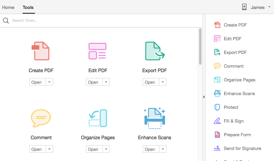
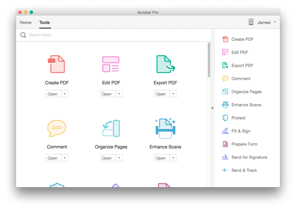
I recently fired up Adobe Acrobat to rearrange some pages in a PDF I was working on, and discovered it now had a brand new interface.

I poked around for a few minutes, and realized I was having trouble figuring out how to do something that had previously been relatively simple, and I was surprised to find myself thinking, Ugh, this is probably another one of those stupid mobile-first designs….
Wait, what!?
I’m not supposed to be thinking things like that. Mobile-first design is a good thing. What self-respecting UX designer would even allow such ideas in their head?
But out of curiosity I looked it up, and sure enough found an inspirational video announcing the redesign:
https://www.youtube.com/watch?v=rahSYl9vxFU
“Multiple devices,” “cloud-connected ecosystem,” etc. They were using all the right words. It felt like this should be an amazing user experience. No question about it.
So why was I sitting here frustrated again, and why was I attributing it to mobile-first design? That couldn’t be right, could it?
As a sanity check, I hopped on Twitter to see if I was the only one feeling this way.
The new version of Adobe Acrobat makes me sad
— Meathead (@meatheadsux) September 3, 2015
Does anyone else despise the new CC version of Acrobat Pro? It has seriously slowed my work rate down with all the stupid tool menus.
— Dave (@crawlspeed) August 26, 2015
Does anybody else hate the new interface for Acrobat Pro DC? #adobe #pdf #design
— Richard Podsada (@rpodsada) August 19, 2015
Okay, so it wasn’t just me.
The fact that I was instinctively starting to think about mobile first designs (as a user) with apprehension, combined with the fact that I was increasingly seeing frustrated users starting to complain about these interfaces, made me start to admit to myself that maybe the mobile-first approach wasn’t the pure, righteous answer we’d all been thinking it was.
Graceful degradation vs. progressive enhancement
Changing screen sizes have always caused problems for user experience designers, but the issue exploded when the iPhone came out in 2007 and sent mobile web usage numbers rocketing upward. What had once been ignored now had to be reckoned with.
This was originally addressed with the concept of “graceful degradation,” which basically means designing for the biggest or most powerful devices, then gradually stripping features or content away based on the constraints of smaller or weaker devices.
This approach was well known before mobile web usage took off, because designers and developers were using this principle to address differences in what cascading style sheets could do in browsers with varying support for different design techniques. In a graceful degradation approach, you might design a beautiful desktop site, and then chop it, squeeze it, strip it, or do whatever else you had to do to create an acceptable version for mobile devices.
A competing philosophy received the name “progressive enhancement,” a phrase popularized by Steven Champeon and Nick Finck in their presentation at SXSW in 2003, “Inclusive Web Design for the Future with Progressive Enhancement.” In this presentation, they included the following introduction:
Compromise is possible and desirable, but such compromise should not come at the expense of the user, but rather in terms of the native capabilities of the user’s choice of device.
Given the powerful capabilities of modern graphical desktop browsers, it is now possible to provide a progressive, gradually enhanced experience across a wide array of browsers, using one markup document and a variety of different stylesheets, not selectively delivered to the user through browser sniffing, but rather requested by the client itself.
Leave no one behind.
The basic strategy of progressive enhancement is to design for the “lowest common denominator,” then add additional optional features based on device abilities.
What is “mobile first”?
As mobile usage continued to dramatically increase over time, the dominant design philosophy began to shift from graceful degradation to progressive enhancement.
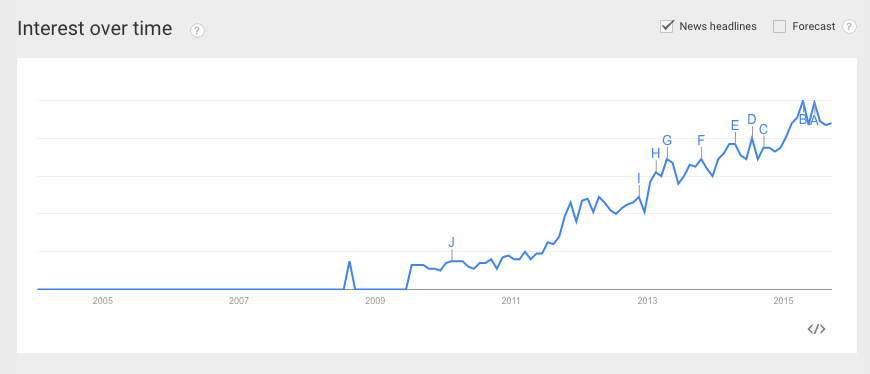
In 2009, Luke Wroblewski wrote a piece called “Mobile First” that gave support (and a catchier name) to the progressive enhancement school of thought.

Wroblewski explained that that designing for mobile makes you focus on the most essential functions and priorities, which ultimately will lead to a less-cluttered experience, even on desktop software.
Right around then, the idea of mobile-first design took off, and has continued to gain momentum ever since.
There’s always a catch
As designers, we want to believe. We want the impossible problems to be solved so we don’t have to keep wrestling with them. We want someone to give us the answer, so we can finally know instead of always wondering.
Mobile-first design sure as heck has all the signs of being The One True Answer. It’s pithy, it’s easy to understand, and it sounds logical.
But user experience design is never that simple. In fact, if you ever feel like a major design problem has finally been solved, you should probably feel concerned, because it’s a lot more likely that people are unknowingly exaggerating the solution’s effectiveness out of a desire to call the problem solved.
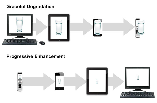
This famous image illustrates well the concepts of graceful degradation (or “desktop first”) vs. progressive enhancement (“mobile first”).

It seems obvious from the sequence at the top that graceful degradation is the wrong answer, leading to a bloated solution that doesn’t work well on mobile.
What’s less obvious, though, is that the progressive enhancement desktop solution also has problems. The solution displayed there seems underdeveloped and inappropriate for the context.
This is the catch of mobile-first design. When we start with the most restrained solution, we tend to get lazy and fail to flesh it out for more robust contexts.
The end result is a design that fails to take advantage of the full native capabilities of the user’s device or context, and can (in the worst cases) seem condescendingly simplistic or childish.
The opposite of a wrong answer is often another wrong answer
When frustrated by an extreme situation, we often react by jumping over to the other extreme. Designing primarily for the desktop and treating mobile as an afterthought was wrong, so as an industry we responded by designing primarily for mobile and treating the desktop as an afterthought.
We didn’t solve the problem. We just flipped it around.
If I were on my phone, I would certain appreciate an interface like the new Adobe Acrobat DC. My fat fingers would have no trouble dancing around the large action buttons, which would be clearly visible on my little phone screen.
However, when I’m comfortably sitting at my desk in front of a large monitor, using a sensitive optical mouse, I don’t have those same constraints. In that context, the giant buttons make the software look more like a Fisher Price toy, almost comically inappropriate for relatively powerful display and input devices I’m using.
New users vs. power users
My wife Katie has a podcast called Doing Business as Family, and we use Adobe Audition for audio post-production. It’s a great piece of software, and while it’s not as simple for new users as, say, Apple’s GarageBand, it’s a much more powerful and flexible tool overall.
GarageBand is a wonderfully-designed and easy-to-use piece of software, so why would we use Audition? Well, it’s because there are two kinds of user-friendliness.
Some software is friendly for new users, but frustrating for power users. The restricted functionality, the giant buttons, the friendly animations, the multi-step processes, etc., all help ease new users into the software with minimal mental strain, and helps them started quickly. This is GarageBand.
Other software, however, is designed for power users who are familiar with what they’re doing, understand the concepts, and prefer the convenience of having information and functionality visible and quickly accessible, even if it means having a busier interface. If you look at any software designed for experts, it almost always looks complicated to those less familiar with it. This is Audition.
In the field of user experience design, there’s a significant bias toward the first kind of user-friendliness. We obsessively optimize for the new user, and assume (often erroneously) that what’s good for the new user is good for everyone. Making things easier for new users is a significant move forward, especially when there’s so much bad software out there, but it’s really just a single piece of the overall user experience puzzle.
This “new user bias” is important to understand because it’s part of why we get mobile first wrong. We’re so focused on concepts like “minimalism,” “simplicity,” “restraint,” etc., that we sometimes forget that those aren’t always the right answer. Sometimes more complex interfaces actually are appropriate, especially for software that’s used frequently, because it increases visibility and efficiency.
The mobile-first design approach plays right into this new user bias, which is part of why it has taken off to quickly within the design community. We love the idea of designing something “so simple a child could use it,” and we sometimes forget that the actual non-child target audience my be frustrated by that kind of interface.
Mobile first is a compromise, not an ideal
In a perfect world, software would have appropriate variations for every device and screen size on which it works. The mobile phone version would be organized appropriately for the screen size and input devices. The tablet version would be different, perhaps taking advantage of the different ways people hold it, accounting for the reduced thumb reach relative to screen size, etc. And then the desktop version might include a different layout entirely, based on the wide screen size, totally different user position, increased input device flexibility, etc.
(These are a few of many examples; there are a lot more contexts to design for than just phone, tablet, and desktop.)
However, we don’t live in a perfect world. We live in a world where pretty much everything has a budget and a deadline, and that means that we have to make compromises for the sake of efficiency.
Mobile-first design isn’t, in itself, the right answer. It’s just an efficient answer. If you can design for one device and then tweak it to more or less function on other devices, you shave a lot of time off the design process. With the cornucopia of possible devices you’d otherwise have to design for, that’s definitely a good thing.
(And there’s something to be said for forcing interface consistency across devices, although I believe the importance of this is often heavily overestimated. The Facebook mobile app and the Facebook desktop web experience are significantly different, for example, but people generally seem to have little problem moving back and forth between them.)
When discussing and promoting mobile-first design, we should remember that it’s an efficient compromise solution intended at accomplishing reasonably good results within constrained budgets and timelines. It’s not, in itself, a shining path toward an ideal interfaces across devices.
Doing mobile-first design the right way
Mobile-first design can work really well, as long as you’re doing it with some solid principles in mind:
- Don’t stop too early. The desktop version of your design shouldn’t just be a large and spread-out version of the mobile interface. There are plenty of web technologies that let you swap out large portions of an interface for different media, so what’s a list on the mobile version could easily become a data table on the desktop version, for example. Make the interface appropriate to the context, even if it means significantly changing certain elements.
- Consider orientation and input devices. The user of your phone app is likely doing many of the actions in portrait mode with their dominant hand’s thumb, so it makes sense to keep the navigation and functionality toward the bottom and middle of the screen. On a tablet, they may well be using both hands (including index fingers) in landscape orientation, which gives you a lot more room for additional functionality within convenient reach. On a desktop, they’re probably using a finely-controlled mouse or trackpad, have a large screen that can easily display things in high detail, and are more likely to expect key functionality to appear at the top of the screen rather than the bottom. All these principles can vary depending on the nature of the application, of course, but you can see how it makes sense to significantly alter the interface for different contexts. If your user has increased display power or input control, take advantage of it appropriately.
- Focus on functionality, not layout. One of the biggest changes that mobile-first design brought about was the move away from a “can’t do that on mobile” mentality. It’s now expected that a mobile interfaces offers access to the full range of functionality the desktop solution might offer. That’s really the key value of mobile-first design. It’s much less important that the experience and interface layout be “the same” across multiple devices.
- Prioritize high-use contexts. If you’re designing an interface for monitoring a nuclear power plant, and the majority of the anticipated usage is by someone sitting at a workstation all day, it’s actually okay to design for desktop first. (This doesn’t mean the mobile interface should be a chopped-down version with restricted functionality, of course—it should allow the user to do almost anything the desktop version does. However, if the usage is significantly skewed toward a certain context, it makes sense to to design for that context first rather than trying to extrapolate it from an interface designed for a different context.)
- Don’t be afraid of genuinely separate experiences. The most restricted versions of an interface should offer the same core functionality as the most robust versions, but it’s okay for certain contexts to look or work very differently if it’s more appropriate for the user’s needs or situation.
- Balance appropriately between new users and power users. Some software really is used once and seldom revisited (e.g., an information kiosk at the mall). For those situations, it can definitely make sense to design the interface to be “Fisher Price simple.” However, if you’re designing an application that people will use on a regular basis as part of their job or lifestyle, it may also make sense to focus on issues of visibility and efficiency first, even if it leads to a more complicated interface. Don’t let mobile-first design force you into biasing inappropriately toward minimalism, because minimalism isn’t the answer to every design problem.
Mobile-first design is great
While I may have tried to knock mobile-first design off its pedestal a bit, I should clarify that I’m a fan of the approach and think it’s a great way to discipline your thinking when it comes to interface design.
We have to remember, though, not to get wrapped up in our worship of any particular UX solution, because UX just isn’t simple enough to have universal answers. Mobile-first design is a compromise approach aimed at coming up with good solutions on tight budgets and timelines, and it actually does a pretty good job of that, even if it’s not the One True Answer to every design situation. Mobile-first design works best when we understand it for what it is, and when we use it as a platform for progress, and not an excuse to skip true context-specific design thinking.


