
I’ve been in the web industry long enough to have gone through a lot of major shifts, and we’re in another one of them right now.
We’ve reached the end of the wireframe era.
For those not familiar with the concept, a wireframe is a structural diagram of a digital page or screen, intended to convey the basic idea before committing it to a full design process. The term was borrowed from the 3D computer graphics space, where line-based outlines were used to visualize proportions, positions, angles, etc., before committing to a time-consuming full visual rendering. In user experience design, wireframes serve the same basic function as construction blueprints or film storyboards: they allow ideas to be discussed and revised efficiently before committing a lot of hours to them.
There was once a time before wireframes were an assumed part of the process, but that was in the mid-to-late 1990s, when the web was still chaotic and new.
By the time I took a full time job in the web industry in 2003, wireframes were such a normal and expected part of the design process that they were never really even discussed. Everyone took them for granted. Heck, even clients who knew next to nothing about the process often still knew there’d be wireframe diagrams, even if they didn’t quite understand what they were yet.
Wireframes saved people a crap-ton of time and money, and they totally made sense. They were the right deliverable for early stages of the design process, and they’ve continued to serve well year after year.
Until now.
Cause #1: Design for efficiency
One of the key reasons wireframes made sense in the early days of the web was that the aesthetic was heavily graphical. Gradients, textures, patterns, shadows, and background images were everywhere, and this was in the era before those things could be easily rendered in the browser, which meant they were all created as static graphics.
Around the time I took that job in 2003, there was a revolution taking place regarding the adoption of CSS and other web standards, replacing the gut-wrenchingly primitive font tags and table-based layouts that had characterized the web up to that point. New CSS trickhacks were being discovered regularly, unlocking what designers could achieve in the browser using the static graphics they’d created. That meant they were opting for even more visually-rich interfaces than before, since they all wanted to push the limits of what CSS could do.
This was also an era before web fonts, which meant that you had two typographical options in your site designs: you used a standard font found on almost every machine (there were only a handful and everyone was sick of them) or you created static graphics for every headline on the site and used image replacement CSS tricks to swap them out individually…for every headline on a site.
(Yes, people actually did that.)
During this time, CSS layout capabilities were still relatively limited and required lots of arcane knowledge and manual coding, so front-end development took significantly longer than it typically does in the current era of front-end frameworks with easy-to-use grid systems.
When you put all that together, you have monstrous design and development hours being put into these sites. And because it was all done manually, it took an equally monstrous amount of time to change anything after it had been done.
Under these circumstances, it’s no wonder that wireframes became an essential part of the design process. Without them, projects would drag on forever and quickly become prohibitively expensive. Every “can we move that over there?” took so long to design and code that wireframes were the only logical solution.
However, for all the excitement among designers and developers at that time, there was surprisingly little thought being put into the sustainability of such an approach. Some experts had the foresight to bring up their concerns, but they were drowned out in the frenzied innovation and experimentation of the era.
Years passed, and those sites become increasingly painful to maintain. Clients started asking for more lightweight designs that wouldn’t cost as much to modify when needed. The smarter and more business-focused the client, the more likely they were to start demonstrating a sleeker, leaner visual aesthetic over time. They then served as role models and trend setters, and others followed them down that road.
The move toward this efficient approach to design (whether you call it lean, lightweight, nimble, flat, or whatever else it has been called) wasn’t motivated by some rockstar designers trying to change the status quo. Instead, it was motivated by client business needs. The old design aesthetic was just too dang expensive, and this new approach was way more modular and cost effective.
With the design style having shifted so radically from a heavy reliance on static graphics manually frankensteined together using janky CSS toward a neat and tidy aesthetic based around straightforward visual treatments and clean typography, the time required to design a typical page has actually gone down significantly.
It used to be that comps were treated as fundamentally different than wireframes, but we’re getting into an era where comps are more like “wireframes in color.” Often, they’re even being designed with the same tools these days.
The less time the visual design takes, the less need there is to wireframe it all beforehand.
That’s the first nail in wireframing’s coffin.
But there’s more.
Cause #2: Efficient design tools
The other thing that happened since those days was that our tools have become a heck of a lot better.
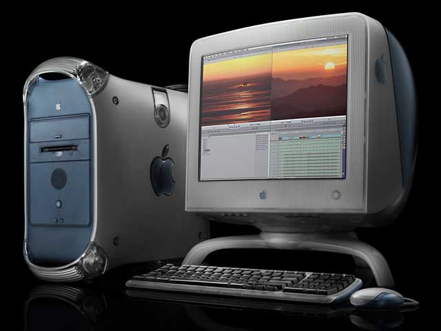
In 2003, a typical profession site probably would have been designed with Adobe Photoshop 6 or 7, probably running on either an iMac G4 or Power Mac G4 desktop (if they were lucky) or some kind of Windows desktop machine. (Macs weren’t nearly as ubiquitous back then as they are today.)
Using Photoshop for digital design had always been kind of an awkward compromise. I mean, it’s right there in the name: Photoshop. It’s photo-editing software that somehow morphed into everything-editing software. It’s bloated, it’s expensive, and it’s only vaguely oriented toward designing for web and mobile devices.
Nevertheless, Photoshop had become so normal for web design that its file extension (.psd) had become the shorthand term for final design deliverables: “Hey, when are you going to send those PSDs over?”
In late 2010, a tool call Sketch was launched. Within a few years, it had shown itself to be the Photoshop killer, and was widely being adopted across the industry. It was buggy, it was different, and it was annoying in a variety of ways, but even so it was still better than trying to use Photoshop for UX work.
Sketch fit almost perfectly with the leaner, more lightweight visual aesthetic that had developed, because it was optimized for that kind of design. I remember being initially concerned about switching to Sketch because I wasn’t sure it could handle a heavier visual design. Eventually, I realized that nobody really did that kind of design work anymore, for the reasons mentioned earlier.
Beyond the visual design tools, the front-end development tools have become wildly optimized as well. Developing the front-end code for a typical design used to involve slicing up a Photoshop comp and then struggling to recreate it in code using a library of unsustainable CSS hacks and inflexible images. These days, though, web browsers can render many visual effects dynamically (less coding), front-end frameworks can do most of the heavy lifting for grids and layouts (less coding), and tools have been developed for standardizing rendering across browsers automatically (less coding). Basic front-end development today is surprisingly simple compared to what it used to be, because browser and libraries can do much more of the heavy lifting now.
These kinds of tools allow both designers to get high-fidelity comps and even code prototypes more quickly than ever before. It’s not to say there’s no work involved, of course. It’s still not easy to do. However, it’s at least a lot easier than it used to be, which means a client asking for a change isn’t the eye-rolling, teeth-gnashing experience it once was. And that means it’s not as critical to decide everything based on wireframes before moving to design.
That’s the second nail in wireframing’s coffin.
But there’s still more.
Cause #3: The visualization problem
Anyone who’s worked in user experience design has probably seen a number of situations where realizations were made during the visual design comp stage required the re-evaluation of things that had already been agreed upon during the wireframe stage. These changes often start with a phrase like, “Well, now that I see it in context….”
There’s a prevalent myth out there that architecture is one thing and visual design is another, and it’s not uncommon to see workflows that involve a UX designer or information architect building the wireframes then handing them off to a visual designer to make it pretty.
The problem there is that the elements of visual design aren’t about prettiness. They’re fundamental to the way we process information. The use of color, lightness and darkness, typography, etc., all shift and shape how users respond. It’s not just a layer of polish. The visual design is fundamental to the user experience.
It’s like the music in a film. A scene that’s profoundly suspenseful or sentimental with the right music could come across as ridiculous or awkward when that music is removed. Showing the scene without music wouldn’t actually give people a good approximation of what the final scene would be like. Instead, it would make more sense to show the scene with at least some placeholder music that approximates what the final music choice might be.
People tend to struggle to imagine what a final user experience might be like based solely on a wireframe diagram. Many UX designers would admit they’re used to hearing things from clients like “I don’t know, it just seems so…plain” or “So, you’re saying the whole website is going to be black and white?” despite having spent uncountable time trying to explain how they should be looking at wireframes. This is because they get that same awkward, incomplete-feeling experience you would if you were watching a movie with no soundtrack.
The fact that it’s not uncommon for realizations during the visual comp stage to trigger changes to things that had supposedly already been agreed upon leads me to believe that maybe wireframes aren’t solving the problem the right way in the first place. After all, if colors, contrast, copywriting, typography, imagery, etc., all profoundly shape the user experience, why are we so insistent about protecting early-stage users from being “distracted” by those things? Wouldn’t it make more sense to be prototyping those as well?
I can definitely understand the need for such an approach in a bygone era in which design and development were so time-consuming and complicated that practicality demanded it. However, if…
- Users have a hard time visualizing a full solution based on wireframes alone
- The final design is actually going to be fairly lightweight anyway
- The tools are so efficient that comps don’t take much longer than wireframes
…then wouldn’t it make more sense to just move directly into the visual design comp stage?
To be clear, I’m still a major proponent of iterative design and progressively-refined prototypes. However, I’ve seen enough projects get through the wireframing stage without really having solved the intended problem of getting the structure nailed down (despite testing, education, best practices, etc.) that I’m not really convinced they consistently accomplish what we think they accomplish.
The spirit of iterative design involves “getting real” as quickly as possible, because the closer you get to reality the more useful your test results will be. If the time spent would be roughly comparable, why spend extra time on a wireframe stage when you could skip it and instead start showing something closer to a real-world design?
UPDATE: Kyle Davila writes…
Great article! I work as an Art Director at a full service agency and when I first started, we skipped the wireframe stage and went directly into visual comps. I think this process has some benefit, but also has a major flaw that I’ve noticed and I would love to get hear your thoughts. I think by showing visual comps and avoiding wireframes, the client has a tendency to get hung up on the smaller things like color instead of focusing on the hierarchy and overall flow. I’ve made the analogy before, it’s designing a logo in black and white first, not color. Otherwise the client will most likely pick the logo in their favorite color, not the best logo.
That’s a really great point, and something everyone should be aware of while implementing something like this. I haven’t noticed this issue coming up much in our situation, but I think that’s probably because of the way our review process works. As a general rule, it’s usually a bad idea to just send designs off to a client and ask for their feedback, because (as Kyle mentions) they’re very likely to focus on the wrong things. Humans are visual creatures, so we get distracted by shiny things.
A lot of that can be solved through coaching, walking the client through things, asking the right questions, and so on. However, this situation also reinforces why client-centered design processes can be problematic. In a user-centered design process, you’d more likely have representative users walking through the interface like they would in real life (ideally focused on accomplishing particular goals) and they’d give generally holistic feedback rather than their opinions on the visuals. This is part of what makes user-centered design so powerful in the first place.
- Client stakeholder: I don’t like it. It’s too purple. It looks like our competitor. And can you make our logo bigger?
- User: What do I click to add a new item?
The user feedback that happens naturally with goal-driven testing is much more representative of the kind of feedback we’d be looking for from a formal wireframing process, but it happens just as effectively (if not more so) with fleshed out comps as it would with traditional wireframes.
Obviously, that requires teaching the client to understand that you’re designing for users, not for them, but that’s a general best practice for user-centered design in general and isn’t specific to the wireframe question.
The great experiment: skipping wireframes
When we first started discussing these ideas as a team, it felt sacrilegious. Wireframes were fundamental. How dare we even consider skipping that step?
However, the logic behind skipping the wireframing stage seemed to make sense, and we know the only way we’d ever really find out would be if we tried it.
We were working on a small application UX project at the time. We introduced the idea to the client, worried they were going to feel like we were trying to shirk our proper duties. After all, we were removing a basic stage of the design process, and replacing it with…nothing. Nothing at all.
The conversation went something like this:
- Client: “So, you’re telling me we’ll be able to review actual design comps instead of just wireframes?”
- Us: “Yes, that’s right.”
- Client: “And the project will actually be completed sooner because of this?”
- Us: “Correct.”
- Client: “…Do we have to pay more?”
We were feeling guilty because we were reducing our overall workload, but from the client’s perspective this was all good news. Like most great design decisions, it was a win-win situation.
We went ahead with our experiment. We did our discovery and research work, roughed out the high-level structure of the application, and then–instead of going into the wireframe stage–we went right into visual comps. We didn’t actually have to invest any significant additional time to do this, because the comps were really not much different than wireframes with color, imagery, typography, and sample text applied.
The results? Both our team and the client loved the process. We “got real” faster, which enabled users to better visualize the final experience and give more useful feedback. We shaved quite a bit of hours off the project, and we reached the finish line more quickly.
As far as we could tell, there were zero negative effects associated with us having dropped the wireframe stage completely. Instead, it was good news all around.
We’ve continued that approach on some subsequent projects, and most of the projects we’re estimating now are based around the idea that we’re skipping the wireframing stage and going right to comps. We fully anticipate these projects also coming in with less effort, shorter duration, and improved results.
The future of prototyping
As digital platforms continue to increase in their capabilities and web interfaces become increasingly interactive, dynamic prototyping with code or code-based tools (already a common practice in many contexts) will quickly become the norm. Wireframes are only the first casualty. Visual comps themselves are next in line for obsolescence.
After all, why waste time creating visual comps that do a poor job illustrating animations, user feedback, dynamic data, and responsive layouts, and that eventually have to get scrapped and rebuilt from scratch in code?
This isn’t a new idea, of course, but the general fear and apprehension that many designers still have about even basic coding have meant that we’re still nowhere close to code-based prototyping becoming the norm yet (although it’s becoming increasingly common).
When I work on personal projects, I actually skip both the traditional wireframing and visual comp phases and instead start prototyping directly in code with a front-end framework like Bootstrap. The wireframe becomes the mockup, and the mockup becomes the live interface. It’s a single prototype being constantly iterated toward a usable state, rather than a disposable deliverable.
The approach of scrapping the wireframe to design a separate comp, then scrapping the comp to develop the front end code, is very nearly obsolete. In coming years, I wouldn’t be surprised to find visual comps themselves being considered an archaic practice.
There’s no question that Sketch is a great user experience design tool compared to Photoshop. However, Sketch isn’t the answer. It’s just an interim step to get us by. The real answer will be a tool that natively allows for prototyping responsive behavior, animations, interactions, state changes, etc., and that generates output that can be turned directly into a working product. Front-end frameworks already accomplish much of that, and tools like Framer are giving us a peek at what the UX designers of the future will be doing.
Kyle Davila writes:
Lately, we’ve skipped the visual comp stage and gone directly into “designing in browser” with an Art Director and Front End Developer working closely together. It’s still cutting down the step, and also cutting out the headache of showing a client a psd file and having development not be able to match it.
There are a lot of tricky issues associated with code-based design, not the least of which is the temptation to design only things that are easy to do in code, but if you can find the right flow it can work really well.
I’ve taught code to a lot of people who were previously apprehensive about it, and I promise that it’s really not that complicated. It can be intimidating for designers to learn at first because because there’s so much information out there that it’s hard to know what you should be studying, but if you find someone who’s pretty savvy about it, they can point you to the right places relatively quickly. (There’s nothing inherently complicated about HTML or CSS. The apprehension comes more from unfamiliarity than anything else.)
Anyway, given the fact that both wireframes and visual comps will eventually become obsolete, it’s perhaps a little less controversial to suggest for now that at least wireframes are probably already there.
The end of the wireframing era
Wireframes have been a fantastic tool for user experience designers, and there are certainly still cases where they’ll come in handy. There’s nothing wrong with roughing out some sketches of an idea to run it past stakeholders and users, for example.
However, as a formal stage in the user experience design process, I definitely think we’ve reached the end of the era in which wireframing should be considered sacred. Times have changed significantly, and many UX designers are doing wireframes out of muscle memory, not because they’re necessarily providing significant value.
If your design team has been considering the idea of skipping the wireframing stage, I’d encourage you to at least try it and see how it goes for you. We were reluctant to try it ourselves, but we did, and it has worked out very well for us so far. (And if you’ve already been skipping wireframing, I’d love to hear about how it has gone for you, whether positive or negative.)
Humans hate change. Change means rethinking things, and our brains are too lazy to want to do that. However, the user experience design field is in constant flux, and it’s not unusual for things once considered completely essential to become obsolete almost overnight. To stay on top of our industry, we have to be willing to give up almost anything we do and replace it when better approaches come along.
This is one of those times when a cherished practice seems to have reached the end of its lifespan, and as user experience designers we have a particular responsibility to let it go and move on.

