· by James Archer · 6 min read
The 10-Point Attention Mapping Exercise
A customer’s attention: it’s exceedingly difficult to acquire, experts measure it in milliseconds, it vaporizes if mistreated, and it’s worth far more than gold or diamonds. Scared? Don’t be—it’s putty if you know how to handle it. **Attention is the most fundamental unit of design.** Once you get p…

A customer’s attention: it’s exceedingly difficult to acquire, experts measure it in milliseconds, it vaporizes if mistreated, and it’s worth far more than gold or diamonds. Scared? Don’t be—it’s putty if you know how to handle it.
Attention is the most fundamental unit of design. Once you get past the color schemes, typography, layouts, graphical treatments, etc., it all comes down to guiding and shaping the viewer’s attention.
Take, for example, this classic ad from Volkswagen.
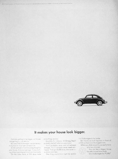
Notice how the designer made the message significantly stronger through creative restraint. The less was included on the page, the more attention each element received. The end result: you can’t ignore the ad. You’re seduced into it. You want to read it, even though it’s just a car ad. They have your attention.
Novice designers attack the attention problem in predictable ways—bright colors, big text, exclamation points—but it’s no surprise that the most proficient designers often tend to be the subtlest as well. A bit of restraint goes a long way when trying to lead the viewer around the key elements of a communication piece.
Your Business Needs an Attention Strategy
The difficult part about designing for attention isn’t deciding what to talk about—it’s deciding what not to talk about. Because you only get a potential customer’s attention for a few seconds (if you’re lucky enough to get it at all) you don’t have luxury of rambling. You have to cover your key points with both speed and strength.
This applies to all marketing efforts—even yours. You might feel that, well, your industry is a little different. People will take their time with it. You don’t need to rush to get to the point. But your industry isn’t different. Your customers are human, and humans have a lot of distractions. Regardless of your line of work, or your medium of communication, it’s essential that you maximize your use of potential customers’ attention.
Just because you’re being efficient doesn’t mean you have to be crude, of course. There’s plenty of room for elegance, subtlety, and mood when it comes to attention-based design; in fact, those are some of the strongest tools designers have for guiding a viewer’s gaze where it needs to go.
The critical lesson here: when working with designers, realize that it’s about much more than your favorite color, or looking “professional,” or communicating every possible fact about your business; it’s about attention and what you do with it.
Attention Mapping: The 10-Point Exercise
This exercise is simple in principle, but difficult in practice. It will make you think. It will make you doubt. And (most importantly), it will make you sacrifice.
Here’s how it works:
- Identify what is being designed. It can be a video, a brochure, a piece of hardware, a website—nearly anything.
- List components of the overall message. Identify everything that you wish the user knew about the item in question. Get it all out of your head and onto the paper.
- Cut the fat. Upon reviewing the list, you’ll notice that some items are more important than others. If you know they’re not critical to the message, get rid of them.
- Distribute 10 “attention points” among the message components. Don’t try to spread them out to thinly, and don’t be afraid to be generous with a particular piece of the message. If something’s important, let it be important. And remember: you’ve got 10 points—no more and no less.
- Clean up the list. Remove any zero scores, and resort the items by their points. Congratulations — you now have an attention map that clearly and concisely tells your business what it needs to promote in order to thrive.
- Obey the list. Now comes the hard part—now that you’ve identified what’s truly essential, you have to act accordingly. Work with your designers to ensure that the final product precisely follows the map you’ve created, and don’t be afraid to revise it if needed.
Hypothetical Example: AquafireClothing.com
Let’s walk through a hypothetical example. Let’s say you’ve got a line of hip, stylish clothing called Aquafire, and the time has come to launch your first website.
Step One: Identify What’s Being Designed
Easy enough. We’re designing a marketing and e-commerce site for a clothing line.
Step Two: List Components of the Overall Message
There’s a lot we can do, but here’s a start:
- Company history
- Company vision
- Company goals
- Corporate team
- Staff profiles
- Product catalog
- Return policy
- Online ordering
- Blog
- Models
- Testimonials
- Affiliate program
- Street team
- Contests
- Promotions
- New seasonal lines
Step Three: Cut the Fat
Okay, okay, we’ll get rid of the fluff and figure out what might most interest or benefit potential customers right off the bat:
- Product catalog
- Testimonials
- New seasonal lines
- Return policy
- Blog
- Contests
- Coupons
Step Four: Distribute 10 “Attention Points”
Hmmm. This is starting to get tricky. Here goes nothing:
- Product catalog (2 points)
- Testimonials (1 point)
- New seasonal lines (3 points)
- Return policy (0 points)
- Blog (2 points)
- Contests (1 points)
- Coupons (0 points)
Return policy with 0 points? That doesn’t seem right at first, but I guess it’s necessary: I’veonly got 10 points, and the other elements are just more important.
Step Five: Clean Up the List
In order of importance, we’ve now got:
- New seasonal lines (3 points)
- Product catalog (3 points)
- Blog (2 points)
- Testimonials (1 point)
- Contests (1 point)
Step Six: Obey the List
Now it’s time to start actually sketching out the site. Based on the list above, a layout like this might work:
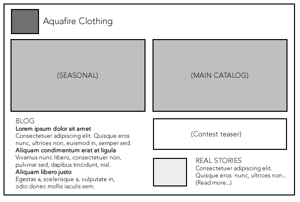
(Note that the points don’t just directly translate into size on the page; their value can be reinforced through colors, lines, shapes, typography, imagery, etc.)
Classic Mistakes
Creating an attention map isn’t easy. Here are some dangerous temptations when performing this exercise:
- Everyone’s a winner: Spreading points thinly because you’re afraid to give anything up. The result? A watered down design with no emphasis on anything, and no clear direction for the viewer.
- Blind passion: Giving so much emphasis (e.g., 8-10 points) to a single item that the others become essentially irrelevant. If the entire Aquafire home page were about the seasonal lines, for example, the main product catalog and the blog wouldn’t be receiving adequate attention.
- Nitpicking: If you start trying to assign fractions of points, you’ve already missed the big picture. Ten points. Keep it simple.
Living the Attention Map
As you get deeper into the process, you’ll begin to realize just how useful attention maps can be, and that you can use them not only for the big picture, but to better plan and understand individual pieces of the puzzle.
In the Aquafire example, for instance, we might create a separate attention map just for the blog section, to determine what features (comments, tags, meta data, author name, etc.) to include with each post.
By creating and following an attention map, you’ll find that you’re successfully able to manage and shape your potential customers’ attention—and isn’t that what marketing is all about?