· by James Archer · 2 min read
Why Those Terrible Campaign Signs Actually Work
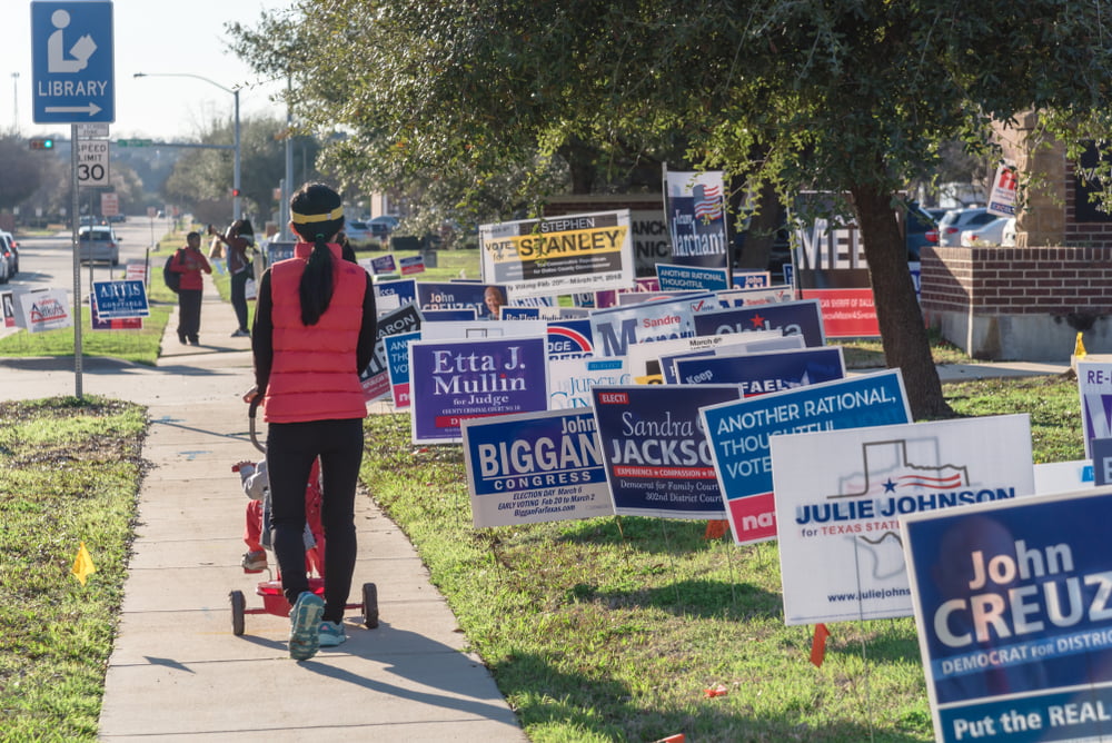
With campaign season in full swing, I’ve had some recent chats with my colleagues about the universally weak and uninspired nature of campaign signs. It seems like political marketing is about nothing more than putting your name on a solid color background (usually blue or red), and maybe adding som…

With campaign season in full swing, I’ve had some recent chats with my colleagues about the universally weak and uninspired nature of campaign signs.
It seems like political marketing is about nothing more than putting your name on a solid color background (usually blue or red), and maybe adding some stars.
Hasn’t creative come further than this over the years? Haven’t we seen the benefits of innovation, differentiation, and fresh thought? Won’t at least one of this candidates try something different? What are they thinking?
However, there’s more to these signs than meets the eye.
Seth Godin recently posted about the effect of online banner ads on eventual (not immediate) sales. The results were fascinating…
If you run banner ads, one study for Harris Direct shows that you can increase your brand awareness about 7% after a reasonable buy of banner ads. That’s just fine, though I’m on the record as saying that most banner campaigns are a waste of money. The kicker? In the study, Harris did the banner buy and watched the number of clicks to their contextual ad (you know, the text ads) go up by 249% over the next week.
Pow.
This means that someone answering the ‘brand awareness’ survey says, “no, I never heard of them,” but then, two days later, is more than twice as likely to click on their text ad.
Political campaign signs make a lot more sense when you realize that they’re not trying to sell you on voting for them — they’re just trying to drill the name into your head, so that when it comes time to vote, they’ve got the all-important “Oh, I’ve heard of them” factor in their favor.
It’s easy to criticize bland advertising like campaign signs from a creative marketing perspective, but the (perhaps unfortunate) truth is that if they didn’t work, candidates wouldn’t keep using them.


